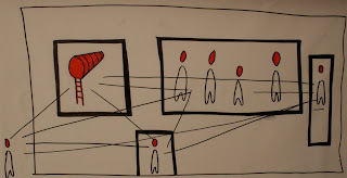
 Facade- King Street
Sunday, June 13, 2010
PROPOSAL 2

 This is the Parti for the back facade of the building, as people are experiencing the art. The art goers are enriched with knowledge as they are inside the building, their thoughts are contained. Their questions about society are becoming clear. They are consumed in their own world, hopefully inspired to make a difference as they leave the building.


PRECEDENTS
 ROUGH SKETCHES
 facade 1
 facade with street aspect
 Interior of museum reception, gift shop/ library, office, bathroom and kitchen. You can see the opening where you would be transported into the double level gallery space.
 Court yard looking on to apartment and artists studio and artists storage space (all glass- continuing the idea of communication and the voice in this building). Green walls on either side- with trees and other plans too.
PROPOSAL 1
 Preliminary sketches->
CURATOR, ARTISTS, ARTWORKS
NARRATIVE
The curator would be a well educated and travelled art theorist and collector that is involved in a lot of humanitarian and social activist work. He believes wholeheartedly that art can change the world by provoking thought. He lives for the cause of the art he displays. He wants to inspire people with beautiful art as well as making them question the way the world is today.
Reflecting the socialist, outspoken nature of Newtown, my art dealer decided Newtown would be an ideal position to place his gallery that holds contemporary artists who explore urban themes, appropriate to Newtowns inner city lifestyle. Themes explored by artists in this gallery would include consumerism, corruption, greed, drugs, terrorism, disasters and adaptation in an environment that is undergoing continual change socially, politically and technologically. There is also a global focus as these are common themes.
ARTIST
Masato Nakamura.
"Mixture of humour with social critique in pop presentation with political awareness." He creates engaging special environments, often commenting on westerns influence on asia that is consequently transforming the landscape.
McDonalds- "dizzying world of bright lights and endless availability".
Interestinly, Newtown used to have a McDonalds (1983) but it was knocked down in 1998 due to changing demographics.
Other artworks include making a statement on the colours of service station logos...

In this art gallery, the aim is to have the viewers continually questioning ‘what age are we living in? Is it a happy/ good/ healthy way to live?'
There is opportunity for people to buy the artworks and therefore be reminded more often of such issues. I would also aim to encourage discussion and debate through art instead of offering simple answers to art viewers.
I have been to the white rabbit gallery in Surry Hills a number of hills and would like to show similar works to what they do.


The Loud Speaker is a motif I would like to use in my building to encouraging people to have a voice and make a difference.
NEWTOWN GALLERY- PROJECT 3
 --Basic site analysis for site 3.
 -- Aboriginal "I have a Dream" mural- near site 3
 -- view from site 3 across king street
 -- back entrance to site 3 via laneway
 -- deep openings in apartments next to site 3. I would like to incorporate this into my design to maintain links in the streetscape.
 -- Apartments next to Site 3
 -- historical monuments
 -- High traffic flow
 -- Some modern square dwellings on the off-streets
 -- Aboriginal mural


 -
- -
-